Uplift models seek to predict the incremental value attained in response to a treatment. For example, if we want to know the value of showing an advertisement to someone, typical response models will only tell us that a person is likely to purchase after being given an advertisement, though they may have been likely to purchase already. Uplift models will predict how much more likely they are to purchase after being shown the ad. The most scalable uplift modeling packages to date are theoretically rigorous, but, in practice, they can be prohibitively slow. We have written a Python package, pylift, that implements a transformative method wrapped around scikit-learn to allow for (1) quick implementation of uplift, (2) rigorous uplift evaluation, and (3) an extensible python-based framework for future uplift method implementations.
Background
Introduction to uplift
Uplift models predict incremental value, or lift

as opposed to outcome models, which simply predict the outcome.

We use “buy” here for simplicity, but this can be replaced with any outcome you desire. How an individual acts when treated and untreated categorizes them into one of the four following “types”:

In an ideal world we would be able to identify each individual by their “type”, and we would target the so-called “persuadables” alone, as this is where we can get the most return on our investment. And we definitely wouldn’t want to target the “sleeping dogs”. In reality we cannot hope to discover the “type of person” an individual is, because we can only show them one treatment! Instead, we look to the power of statistics and machine learning to tell us what groups of “similar people” would do on average. This is what uplift gives us. Each individual gets a lift score between -1 and 1, and this is used to determine who to target. If we have an accurate model, those with higher positive scores will respond better to the treatment and therefore should be targeted, whereas those with low negative scores will respond badly and should not be targeted.
Motivation
The most accurate way to implement uplift modelling is to change your loss function so it maximizes lift. A wonderful, commonly-used and fully-featured implementation of this can be found in Leo Guelman’s R Uplift package. However, such loss functions are difficult to optimize, and so these sorts of implementations end up being slow, particularly compared to the beautifully optimized machine learning algorithms in scikit-learn. Moreover, the change in the loss function needs to be implemented separately for every machine learning model you want to use. This can make it challenging to tune hyperparameters, test different machine learning algorithms, or scale and retrain the model.
To deal with these problems, we’ve decided to sacrifice a bit of the elegance of the theoretically optimal solution in the name of speed. In pylift, we implement a method known as the Transformed Outcome, which, true to its name, allows you to simply transform your outcome label and leverage scikit-learn algorithms. However, we’ve written the code modularly enough that other proxy methods can be added relatively easily.
The transformed outcome tree
Uplift models require two pieces of information for each person: a treatment label and an outcome label. Ideally, you will have some experimental data in which individuals were randomly assigned to a treatment group or a control group. Based on each individual’s response to the treatment, the outcome label is transformed as follows (Athey and Imbens 2016):

At first glance, it may not be clear why we would want to label people this way, and it will likely raise a lot of questions. Shouldn’t the lower right quadrant — those who are treated but did not buy — be just as bad as those who purchased in control? Why the factor of 2? This may seem unintuitive, but there is a very good reason for it. If you take any group of people and randomly assign them to treatment and control, the average value of this transformed outcome across the group is the lift for that group.
To see why, consider a group of 2n people, with n randomly assigned to treatment t and the other n assigned to control (c ). For simplicity we will label those in the treatment i =1 ,…, n and those in the control i =n+1 ,…, 2n. For each user, the original and transformed outcomes are denoted by yi and zi , respectively. For this group of people, the lift in purchases is given by

That is, the average value of the transformed outcome is the lift on the group.1 This elegant transformation has greatly simplified the uplift problem. If we can build a regression model for z, we can now infer the uplift for customers described by features, x:

In theory, we can therefore simply transform our labels as indicated above, then train our models using regular scikit-learn packages. In practice, however, there are some subtle concerns with this method.
- The transformation needs to be adapted to the size of the treatment and control groups.
- Evaluation metrics such as qini need to be adapted to prevent overfitting to the treatment flag.
- To tune hyperparameters, the scoring function need to be customized.
In light of these difficulties, we reasoned that a package was warranted.
Evaluation metrics
One of the biggest difficulties in uplift modeling is coming up with a useful evaluation metric. We’ll explain one popular metric below, and how we adapted it to accommodate the Transformed Outcome method (though we concede that our adaptations are still not perfect!).
The typical metric for evaluation is the Qini curve, which represents a normalized incremental value/gains on the y axis against percentage of people targeted φ on the x-axis:

where nt,1(φ) and nc,1(φ) represent the number of responders in the treatment and control groups, respectively, for the fraction φ of people targeted. Nt and Nc represent the total number of people in the treatment and control group (independent of φ). Because Nt and Nc do not depend on φ, if the treatment/control imbalance is not random as a function of φ, the Qini curve can be artificially inflated. To correct this, we’ve included two versions of the following curve:

where nt(φ) and nc(φ) represent the number of individuals/observations in the treatment and control groups for the fraction φof people targeted. should be chosen to represent the percentage of the population that you are targeting.
First, we implement the conventional cumulative gain chart (Gutierrez and Gerardy 2016), for which we approximate φ with

This is the most unbiased estimate of the uplift. We also include an adjusted Qini curve, for which we approximate φ with2

How it works
Features of pylift
The primary features of this package are:
- A `TransformedOutcome` class, which implements the transformed outcome tree method completely, from transformation to evaluation.
- An `UpliftEval` class, able to be used independently of the TransformedOutcome class, for visualization and evaluation of any uplift model.
Model creation
Model creation can be as simple as follows, using xgboost as the default sklearn object:
from pylift import TransformedOutcome up = TransformedOutcome(df, col_treatment=’Treatment’, col_outcome=’Converted’) up.randomized_search(n_iter=200) up.fit(**up.rand_search_.best_params_) up.plot(plot_type=’cgains’, show_practical_max=True, show_no_dogs=True)

A few more advanced evaluation tools are also included, including different kinds of evaluation curves and evaluation metrics (see documentation). Notably, we found it useful to incorporate error bars calculated by adjusting the train-test-split and averaging the resulting adjusted qini curves, as well as theoretically maximal curves.
up.shuffle_fit(params=up.rand_search_.best_params_) up.plot(show_practical_max=True)

Model evaluation
If you’d like to simply use the evaluation metrics without the scikit-learn wrapper (i.e. if you want to make the same plots we did, all you need are three vectors:
- Treatment: binary treatment/control flag, passed in as 1s and 0s.
- Outcome: outcome — can either be a 1/0 flag or a continuous variable, such as revenue.
- Predictions: your predicted uplift, which is used to order customers along the Qini curve x-axis.
Then proceed as follows:
from pylift import UpliftEval upev = UpliftEval(treatment, outcome, predictions, n_bins=20) upev.plot()
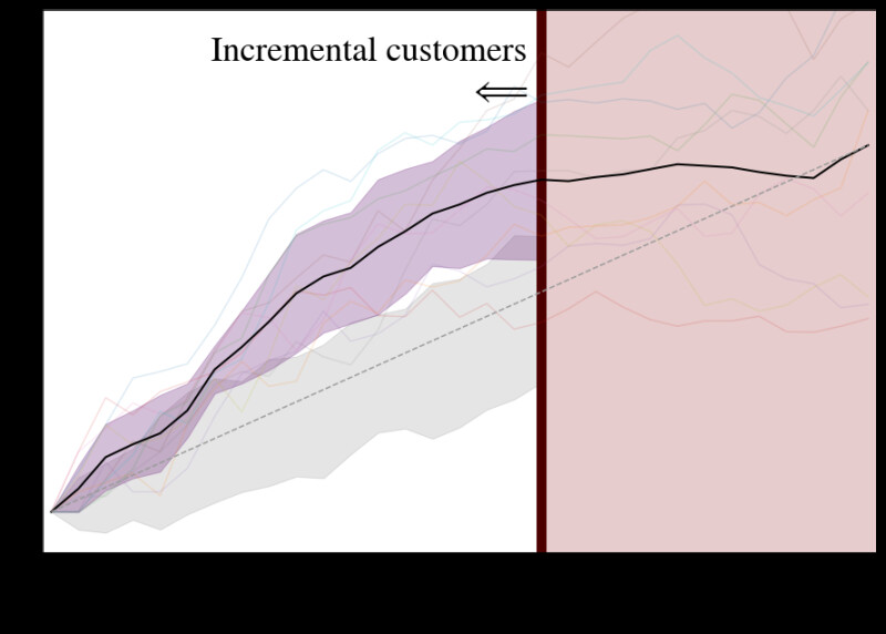
Comparison to UpliftRF
Although we have not had a chance to thoroughly compare our package performance against other methods (doing so fairly is nearly impossible, as success can be data-dependent!), we at least tested our package on data produced by Leo Guelman’s ` sim_pte` function, following an example in his documentation:
dd <- sim_pte(n = 2000, p = 20, rho = 0, sigma = sqrt(2), beta.den = 4) dd$treat <- ifelse(dd$treat == 1, 1, 0) train = dd[1:1600,] test = dd[1601:length(dd$X0),] fit1 <- upliftRF(y ~ X1 + X2 + X3 + X4 + X5 + X6 + trt(treat), data = train, mtry = 3, ntree = 100, split_method = "KL", minsplit = 200, verbose = TRUE) pred <- predict(fit1, test) perf <- performance(pred[,1], pred[,2], test$y, test$treat)
We then saved the scores and fit this data in pylift. A comparison is shown below.

Certainly this comparison is a bit unfair, as we tuned our hyperparameters, while there is no guarantee that those used in the upliftRF example were tuned. However, we can safely say that there exists a set of problems for which pylift, with hyperparameter tuning, fares better than upliftRF without.
Looking Forward
We are excited for you to start using the package and finding new improvements! While we have not extensively tested our method against other methods, we’ve found that our package generally produces improved incremental conversion rates over other package implementations without hyperparameter tuning. Granted, with the more appropriate Kullback-Leibler divergence splitting criterion or splits on significance, improved lift could likely be obtained if the correct hyperparameters are found, but in our case, time constraints on model delivery often preclude such exhaustive searches. Much of the world of personalized treatment is still left to be explored, and we hope that our package will help you painlessly navigate this space!
Find our package on GitHub!
Footnotes
1. One can also show that minimizing the MSE between the model uplift and z is equivalent to minimizing the MSE between the model uplift and true uplift (see [3] for a proof)
2. The adjusted Qini can be useful when the percentage targeted is small and treatment group members are valued disproportionately higher. In this case, the adjusted Qini overvalues treatment group information to prevent overspending.
References
[1] Gutierrez, P., & Gérardy, J. Y. (2017, July). Causal Inference and Uplift Modelling: A Review of the Literature. In International Conference on Predictive Applications and APIs (pp. 1-13).
[2] Athey, S., & Imbens, G. W. (2015). Machine learning methods for estimating heterogeneous causal effects. stat, 1050(5).
[3] Hitsch, G., & Misra, S. (2018, January). Heterogeneous Treatment Effects and Optimal Targeting Policy Evaluation. Preprint
Acknowledgments
A big thanks to those at Wayfair who contributed code, provided helpful feedback and suggestions, and tested the package — George Fei, Hartley Greenwald, Hussain Karimi, Le Wang, Minjoo Kim, Peter Golbus, and Yun-ke Chin-lee. Also thank you to Jen Wang, Anvesh Sati, and Dan Wulin for giving us the time to make this release possible. Finally, thank you to Rachel Kirkwood for her tireless help on this blog post!
